Who would’ve thought that the absence of color can turn your website from bland to grand?
Website designs with black, dark, and gloomy themes take the center stage today – and they demand to be adored. Different colors signify meanings and personalities. Red is passion and danger, blue is warmth and trust, green is nature and health.
Black, however, is a versatile shade that adapts to how you use it. It could mean prestige, strength, elegance, appeal, or seduction. Dark-themed websites help alleviate eye symptoms such as eye strain, dry eyes, and fatigue. And if you’re on mobile, going dark mode means extending battery life by up to 30%, too.
Let’s dive into these 12 best dark-themed website designs and see how the designers behind each creation brought the best out of this color.
+ Work preview on the homepage
+ Great transition effect
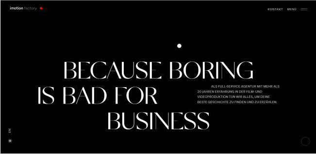
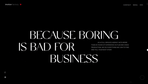
One of the clever things immediately noticeable on the Imotion Factory website is their logo. Film buffs would agree that the red dot beside their name is a genius but subtle way to position them as a full-service video production agency.
Upon entering the website, visitors are greeted with a gripping copy in a big decorative typeface. With an all-black page, this part is maintained clean and minimalist. The menu navigation is on the upper right corner, displaying only two clickable options: Contact and Menu (which displays the different pages you can visit once clicked). On the lower right corner, you’ll see a circular loading indicator. This small element complements the overall motif of this dark-themed website as a film production agency
And just when you thought Imotion Factory has maxed up all their quirkiness, they surprise you with another creative move. Unlike most websites that embed videos, they display diagonal stills on their homepage that melt like water when you scroll up or down. These static images come with the project title, play button, and a Call to Action (CTA) button going to its information page.
+ Dynamic, mechanical illustrations
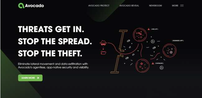
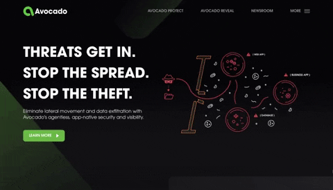
Avocado Systems, despite its fruity brand name, is a brand that focuses on application security. And what better concept to use for its website than a dark-themed, cutesy and mechanical design, right?
If we were to encapsulate this website design, the words we’ll use would be: organized and systematic. Considering Avocado Systems’ nature of business, PopArt Studio did an A+ job in making sure the design itself IS the brand.
Unlike some of the websites that follow on this list, PopArt Studio didn’t use dark colors to simply breathe creativity onto this website. They include vibrant colors such as blue, purple, yellow, and orange in contrast to the black and dark green theme.
The little mechanical animations throughout the pages are such a sight to see. PopArt Studio managed to present the systems in a user-friendly and creative way.
+ Product catalog, lookbook style
+ Accessibility assistant tool for display preferences
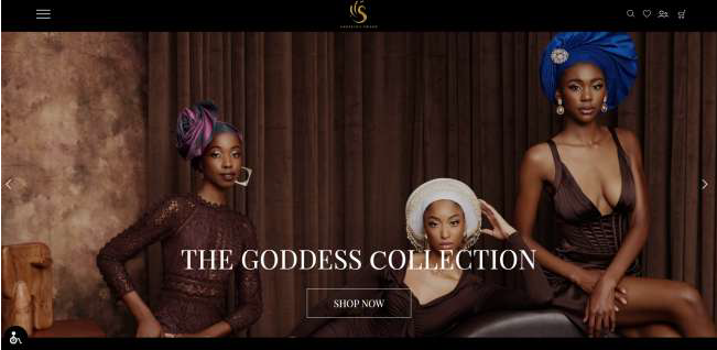
Fashion, culture, and design in one.
Browsing Angeline Swann’s dark-themed website, designed by Get Great Sites, takes you on a lavish journey. The white and gold texts are beautiful accents to this creation. They mix well together with the black background and high-fashion photography displayed throughout the site’s pages.
The bread and butter of this design are the product features – which makes perfect sense since they’re selling gorgeous geles, ornamental head covering usually made of woven cloth, and most popular among Nigerian women.
Feast your eyes on the homepage gallery and full-screen video clips. They also have a Lookbook page, a compilation of ethereal and chic photographs featuring the geles.
This dark-themed design is inclusive, too. The Accessibility Assistant tool is proof of this. Visitors with visual issues can diversify the look of this website according to their preferences, without disrupting the theme as a whole.
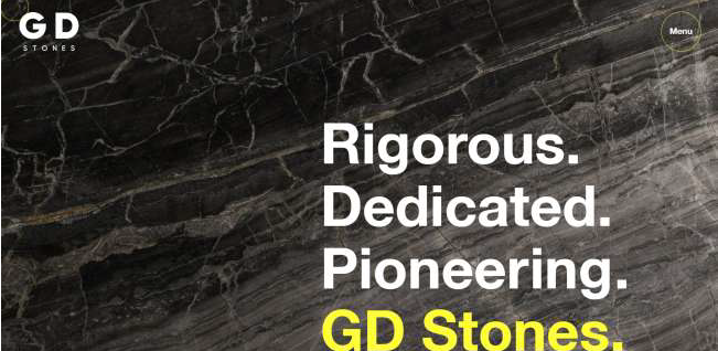
+ Minimalist navigation menu
+ Marble-like textured background
+ Complementary font styles
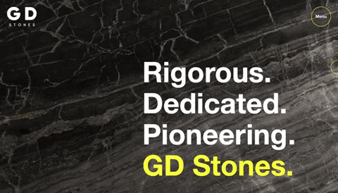
GD Stones website design stays true to its brand. With a marble-textured background, Bluestone98 rocked this dark-themed website really solid.
Huge, in-your-face copy takes over the whole screen but not in a dominating way. The texts are either in white or yellow. Bluestone98 uses yellow to emphasize or bring attention to certain content. Notice how in the header, three one-word copies are in white before presenting the brand name in yellow.
A short brand video playing on a loop is fixed on the homepage, showing a glimpse of how GD Stones works.
The News section is designed impeccably, too. As the only section in yellow, one would think Bluestones98 aims to communicate that the News Section is relevant with vital pieces of content ready for viewer consumption.
Each news piece is presented one by one, catalog-style, complete with a title, date published, an introduction, and a CTA to read more. On either side of the news piece image block, are arrows you can click to view the next article or the previous one.
+ Puzzle cut-inspired images
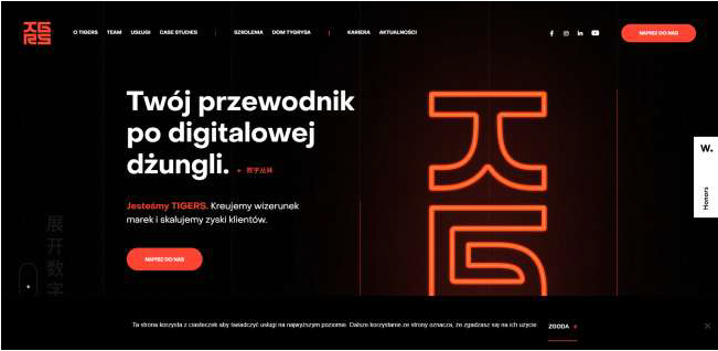
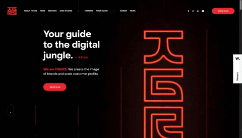
Wise People decided to combine two strong color shades in one website design and it came out exactly what it aims to be – dominant.
This dark-themed website design boasts many top-tier qualities. One, its black theme with a touch of red in a slightly lighter hue gives off the right amount of intensity that Tigers offers its clients. Their tagline, “We will show you the right way” cannot be conveyed as strongly as it should when any other color than black and red is used.
Also, the images showcased through the website are creatively presented. They’re not in squares or rectangles but in puzzle-like shapes. Along with the vertical lines (in gray and red) in the background, these puzzle-like pieces add depth and dimension to the design.
Lastly, when you scroll down just above their footer section (homepage), you’ll see a space dedicated to their past clients. Unlike other web designs that simply display all logos at once, row by row, Wise People added the previous and next functions to keep the logos organized and uncluttered.
+ Discreet menu navigation
+ Dynamic portfolio at homepage’s center
+ Section titles in badge designs
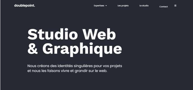
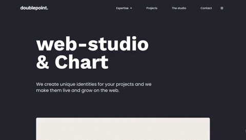
One scroll down the homepage and you’re in for an attention-grabbing GIF of DoublePoint’s works. Placed at the center of the screen, this square animation acts as a window to everything DoublePoint can do for you – a quick peek of their creativity and credentials.
The background color alternates between black and red, which is a nice touch.
One of the many things that will catch anyone’s eye when browsing DoublePoint Studio’s website are the section titles. You’ll see rotating circles on some sections of the site (particularly the Contact and Our Services sections when you scroll down), designed like badges that have titles written on them.
At a glance, this design might look simple, but the beauty lies in the details. For example, try visiting the Projects (Les Projects) page, you’ll get a breathing red heart alongside the page’s header copy. In English, it translates to, “Projects made with love for you”. The red heart is a nice move to lessen text while keeping the viewer’s eyes glued to the copy.
+ Modern art with touches of pop culture
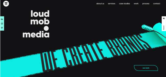
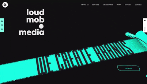
Loud Mob Media, a Creative Modern Studio based out of Pune and Bangalore, India, has a website design that is a brave one, challenging the rules of web design and creating their own brand that is young, vibrant, and daring.
A roller paintbrush enters the screen, revealing the brand’s main message,“We Create Brands”, in teal paint. Right below it is a CTA button going to their portfolio or Our Work page.
Out of all the many reasons, Loud Mob Media is rightfully on this list because of their effort to make graphics and copy dynamic. It almost seems like these elements follow the user’s movement, their scroll, their eyes, and then eventually put more attention to the sections they want to highlight.
When you scroll down further, you’ll witness two different fonts in one frame, overlapping texts and graphics, a CTA in the middle, animation that moves simultaneously. However, contrary to being just a dump of clutter, this section came out as a beautiful mess.
Every page in Loud Mob Media’s dark-themed website is customized according to the page’s main message. With different header graphic animation that greets the visitors, you’re surely in for a creative surprise!
+ Minimalist design overall
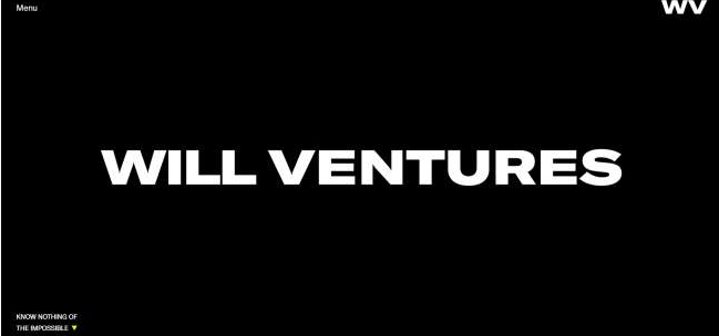
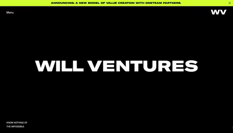
The will to stay is greater in Butter Studio’s design of Will Ventures website.
This dark-themed website design follows a minimalist philosophy. Bold white texts in uppercase rest comfortably on a plain black background. Their straightforward and simplistic approach is the company's specific edge in the sea of competition. Anyone visiting this website is guided properly through what the brand is, their services and offers, their past work, and contact information.
Distinct CTA buttons are distributed in the right amount. On the homepage, you’ll notice a unique but effective take on these CTAs. After the brand name appears on the header, this CTA shows on the lower-left corner of the page: Know Nothing of the Impossible. This is the brand’s tagline but doubles as a click-bait to first-time site visitors too.
Touches of yellow are visible across the website too, which is a great way to contrast the dark theme of the website. These yellows show on CTAs or any other clickable texts when hovered over.
+ Video preview with a play button
+ Smooth element entrance per scroll
+ Menu navigation on the footer section
If you’ve watched any Tim Burton films (who hasn’t, really?) and loved them, you will fall in love with this website design, too.
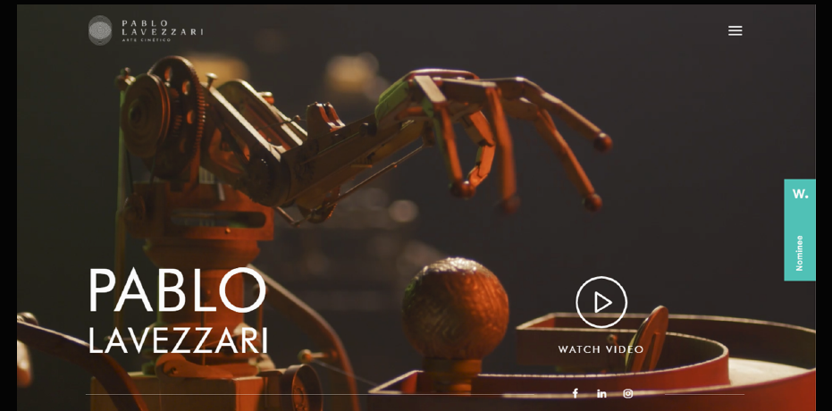
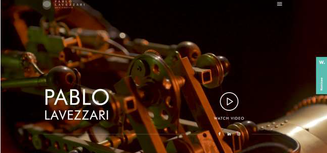
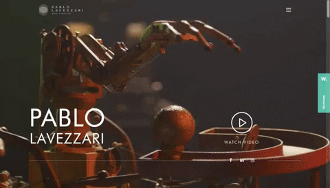
Pablo Lavezzari is an artist in his field, combining vision, creativity, and mechanics into enigmatic pieces of art. His artistry is showcased by Cinergia Estudio Creativo in this dark-themed website design.
They generously displayed his works, beginning with a video reel of Lavezzari’s creations on the homepage’s header. The video reel plays quietly on the background on loop, but if you want to watch the whole thing, there’s an optional Watch Video button parallel to the artist’s name.
One of the design agency's smart touches on this website is the solar-system-inspired backdrop for the copy: “I build universes within the universe”. A design that complements the artist’s vision is a match made in heaven.
This website design has discreet menu navigation. It only has a hamburger menu icon at the upper right corner of the page. Once clicked, it displays the pages and categories you’re supposed to visit.
+ Creative and concise submission form
+ News ticker on all pages
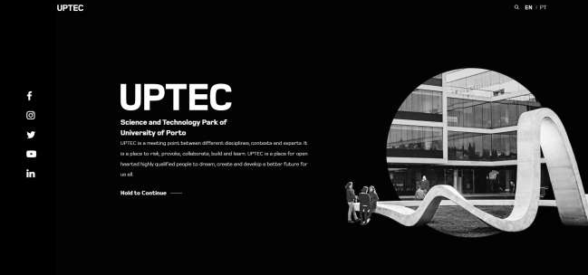
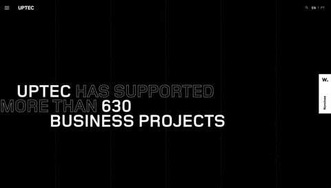
Shapes on shapes. Bold fonts versus hollow.
The Uptec website design by Miew Creative Studio is adventurous. They incorporate contradicting shapes and elements and blend them aesthetically.
Like the website design for Tigers, Uptec has vertical lines in the black background too. On top of these vertical lines are a bunch of circles (above the fold area) that slowly disintegrate when you scroll down.
This design stays true to the dark theme of the website by refusing to use colors other than black and white.
The texts are either in bold or hollow fonts. Unlike other web designs listed here that utilize color to emphasize certain copy, Miew Creative Studio changes the font style for the important, must-read texts into the hollow font.
Every brand’s goal in having a website is to increase awareness and generate leads. Conversion is often a top-priority as well, that’s why CTAs exist. Miew Creative Studio takes the spotlight in designing awesome, eye-catching CTAs no one will dare miss (or deliberately ignore)!
Scroll through the bottom of the page and you’ll see an eccentric CTA. A huge illusion-like dynamic “Apply” button that covers most part of the screen links to Uptec’s submission form. The website also features a news ticker type of Newsletter CTA on the end border of the page.
+ Visible sections as content dividers
Color emphasis upon hover
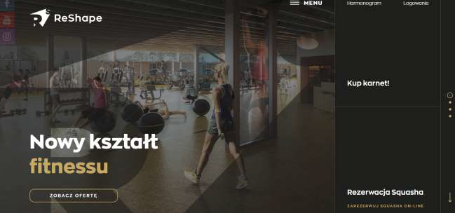
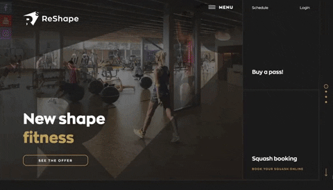
One glance and you’ll know exactly where to go. ReShape’s website design by Challenge Studio is straightforward, organized, and clean.
Above the fold, all options are deliberately presented to you without even scrolling down. Three CTAs are visible and specifically link to the Offers page, Buy a Pass, and Reserve Squash option. This design move could have two opposite outcomes; one, your visitors might feel overwhelmed with a lot of options laid out for them at once, or two, they might thank you for making things easier for them.
In the case of ReShape’s web design, Challenge Studio made a conscious effort not to overwhelm their viewers by adding margins and putting some content in blocks. Therefore, a viewer’s attention doesn’t fall at one cramped-up space, but at organized sets of content that doesn’t look confusing.
Considering the amount of information on this site, their menu navigation remains clean. Each information/page is grouped into categories such as services, goals, team, and reservations.
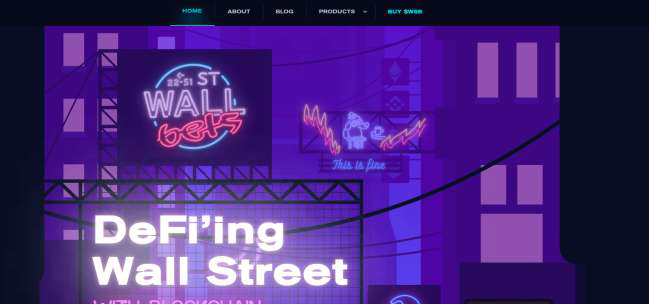
+ Modern street aesthetics
Out of all the designs listed here, this website design by Innovation Theory has more purple than black – but it doesn’t make it any less, of course! In fact, its dark purple motif is the best choice for WallsStreetBets’s overall theme: futuristic and modern.
Elements used are closely related to blockchain and cryptocurrency. These are designed as attractive LED graphics that quickly snatch the attention of the viewer. The welcome page greets its visitors in modern street aesthetics.
Para ver la lista completa ingresá a https://www.designrush.com/best-designs/websites/trends/best-dark-themed-website-designs
Y para conocer todo sobre Pablo Lavezzari ingresá a https://cinergiaestudiocreativo.com/trabajos/pablo-lavezzari